YouTube Redesign: See the New Player and Features
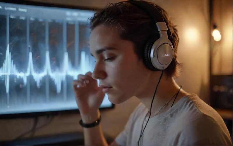
It’s funny how sometimes a small change can make you stop and wonder if something’s gone a bit wonky, isn't it? I’ve definitely had those moments lately, especially when I’m trying to catch up on my favorite channels or just unwind with a video. You know, those times when you're ready for a good old-fashioned binge, but then you notice everything just… looks a little different. This has been a recurring thought for many of us as YouTube rolls out its latest redesign, and it's a pretty neat development, even if it takes a moment to adjust.
The folks at YouTube are clearly aiming for a more streamlined and engaging experience, which I can certainly appreciate. As reported by Mashable, the core idea behind this "updated video player" is to offer a "cleaner and more immersive" feel, with the goal of "obscuring less content." That makes sense, right? We’re there to watch, after all. I’ve noticed the buttons feel a bit more fluid now, and on my TV, seeing those video details gracefully slide to the top-left corner is a subtle but welcome shift. Even the double-tap to seek feature, which I use constantly, feels more refined, showing precisely how many seconds I’m jumping forward – a small touch that really enhances the flow.
Beyond the player itself, YouTube is also tweaking how we interact. The new comment threading, for example, is a thoughtful update, promising a more organized way to follow conversations, as detailed by Social Media Today. And the custom like animations are a delightful little surprise! Who knew a simple like could become a mini-show of its own, with a musical note popping up for a song or a sports cue for a game? It’s these little touches that can really bring a platform to life, making it feel more dynamic and, well, more human. These changes are rolling out globally, so if you haven't seen them yet, you likely will soon. It’s a reminder that even the platforms we use every day are constantly evolving, trying to keep pace with how we want to consume content.
It makes you wonder, what other subtle enhancements are quietly making their way into our digital lives, and how will they shape our online experiences in the coming months?